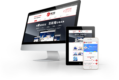
隨著移動設備的普及,越來越多的用戶使用手機和平板電腦來訪問網站。因此,網站制作中的響應式設計和移動端優化變得越來越重要。這里
濟南網站開發公司小編將介紹響應式設計和移動端優化的概念以及如何在網站制作中應用它們。
With the popularity of mobile devices, more and more users are using their phones and tablets to access websites. Therefore, responsive design and mobile optimization in website production have become increasingly important. Here, the editor of Jinan website development company will introduce the concepts of responsive design and mobile optimization, as well as how to apply them in website production.
一、響應式設計
1、 Responsive design
響應式設計是指網站能夠根據不同的設備和屏幕大小自動調整布局和內容的設計方法。響應式設計可以讓網站在不同的設備上都能夠提供佳的用戶體驗,無論是在桌面電腦、平板電腦還是手機上。
Responsive design refers to the design method in which a website can automatically adjust its layout and content based on different devices and screen sizes. Responsive design allows websites to provide a great user experience on different devices, whether it's on desktops, tablets, or phones.
響應式設計的實現需要使用CSS媒體查詢和彈性網格布局等技術。通過CSS媒體查詢,可以檢測設備的屏幕大小和分辨率,并根據不同的條件應用不同的CSS樣式。彈性網格布局可以讓網站的布局自適應不同的屏幕大小,從而保證網站在不同的設備上都能夠提供好的用戶體驗。
The implementation of responsive design requires the use of technologies such as CSS media queries and elastic grid layout. By querying through CSS media, the screen size and resolution of the device can be detected, and different CSS styles can be applied according to different conditions. Elastic grid layout can adapt the layout of a website to different screen sizes, ensuring that the website can provide a good user experience on different devices.
二、移動端優化
2、 Mobile optimization
移動端優化是指針對移動設備的特點和用戶行為進行的網站優化。移動設備的屏幕較小,網絡速度較慢,用戶行為也與桌面電腦有所不同。因此,在網站制作中需要針對這些特點進行優化,以提供佳的用戶體驗。
Mobile optimization refers to website optimization based on the characteristics and user behavior of mobile devices. Mobile devices have smaller screens, slower network speeds, and different user behaviors compared to desktop computers. Therefore, in website production, it is necessary to optimize these characteristics to provide a better user experience.
移動端優化的具體方法包括:
The specific methods for optimizing mobile devices include:
1.壓縮圖片和文件大小,以提高網站的加載速度。
1. Compress images and file sizes to improve website loading speed.
2.使用簡潔的設計和布局,以適應移動設備的屏幕大小。
2. Use concise design and layout to adapt to the screen size of mobile devices.
3.使用大號字體和簡潔的文本,以提高移動設備上的可讀性。
3. Use large fonts and concise text to improve readability on mobile devices.
4.使用觸摸友好的設計,以適應移動設備的用戶行為。
4. Use touch friendly design to adapt to the user behavior of mobile devices.
5.使用移動設備的特性,如GPS、攝像頭等,來提供更好的用戶體驗。
5. Use the characteristics of mobile devices, such as GPS, cameras, etc., to provide a better user experience.
三、如何應用響應式設計和移動端優化
3、 How to apply responsive design and mobile optimization
在網站制作中應用響應式設計和移動端優化需要考慮以下幾個方面:
The application of responsive design and mobile optimization in website production needs to consider the following aspects:
1.設計階段:在設計階段需要考慮不同設備的屏幕大小和分辨率,以及移動設備的特點和用戶行為。設計師需要根據這些因素來設計網站的布局和內容。
1. Design phase: In the design phase, it is necessary to consider the screen size and resolution of different devices, as well as the characteristics and user behavior of mobile devices. Designers need to design the layout and content of a website based on these factors.
2.開發階段:在開發階段需要使用CSS媒體查詢和彈性網格布局等技術來實現響應式設計。同時,需要對網站進行移動端優化,如壓縮圖片和文件大小、使用大號字體和簡潔的文本等。
2. Development phase: In the development phase, it is necessary to use technologies such as CSS media queries and elastic grid layouts to achieve responsive design. At the same time, it is necessary to optimize the website on the mobile end, such as compressing images and file sizes, using large fonts, and concise text.
3.測試階段:在測試階段需要測試網站在不同設備上的表現,包括桌面電腦、平板電腦和手機等。測試人員需要檢查網站的布局、內容和功能是否在不同設備上都能夠正常顯示和使用。
3. Testing phase: During the testing phase, it is necessary to test the performance of the website on different devices, including desktops, tablets, and phones. Testers need to check whether the layout, content, and functionality of the website can be displayed and used normally on different devices.
響應式設計和移動端優化是網站制作中不可或缺的部分。通過應用這些技術,可以提供佳的用戶體驗,無論是在桌面電腦、平板電腦還是手機上。還有什么問題就來我們網站
http://m.qanho.com咨詢吧!
Responsive design and mobile optimization are indispensable parts of website production. By applying these technologies, a better user experience can be provided, whether on desktop computers, tablets, or mobile phones. If you have any further questions, please come to our website http://m.qanho.com Consult!


 本網站部分資源來自互聯網,如有侵權,請聯系我們及時刪除.


 727671696
 15508684333
 在線留言
在線留言